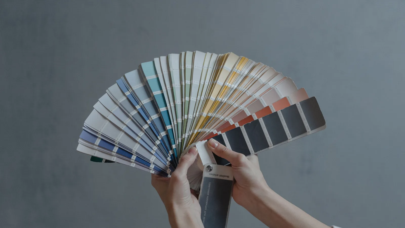
Picking a paint color is the part of a project most people worry about — and for good reason. A chip the size of a business card tells you very little about how a color will look across a whole room. Here's the approach we suggest to our own customers.
Start with what's staying. Flooring, countertops, cabinets, furniture and large artwork aren't changing, so the wall color has to work with them. Hold your options up against those fixed pieces first and rule out anything that clashes.
Look at the room's light. North-facing rooms get cooler, softer light that can make colors look darker and grayer. South- and west-facing rooms get warm, strong light that can make colors look brighter and warmer. The same gray can look blue in one room and beige in another.
Test on the wall, not on the chip. Paint large samples — at least a couple of feet square — on two or three different walls, and look at them in the morning, at midday and in the evening with the lights on. Live with them for a day or two before you decide.
Think about sheen too. Flatter finishes hide wall imperfections and feel soft; glossier finishes are easier to clean but show every bump. Most living spaces look best in eggshell or satin, with semi-gloss on trim and doors.
When in doubt, go slightly lighter. Colors almost always look darker on the wall than on the chip, because the color reflects back onto itself across the room.
We're happy to talk colors and sheens through with you during your free estimate. Call NR Painting at (737) 323-0001 — we serve Boise and every community within 30 miles.